Improving the Outings mobile app with guerrilla usability
July 23 – Aug 12, 2018
DEMONSTRATED SKILLS FOR THIS PROJECT
- Define and recruit target users
- Draft and iterate a moderator’s guide and test script
- Create user tasks with defined criteria for measurable results
- Run and record usability test sessions, including first-run experience
- Analyze test sessions, with a focus on touch-based interaction and issues related to participants’ understanding of and desire to use the app
- Synthesize results into a clear presentation of prioritized findings
- Review teammates’ reports and provide constructive feedback
- Meet all deadlines and effectively collaborate with teammates
Scenario
As part of my graduate work in Usability, I worked on a team project to assess Outings, a mobile application from Microsoft designed to help users discover beautiful and interesting places. My team conducted a mobile guerrilla study to test the efficiency of its navigation, the effectiveness of its content, and overall user satisfaction.
Our Process
Study Goals
- Find out if users understand Outings’ value proposition.
- See how easily users can navigate the app’s primary features.
- See how easily users can personalize Outings to suit their activity preferences.
- Determine whether users can use Outings to help with their
travels.
Moderated, in-person usability testing
First, my team defined our target user type and devised a screener for recruiting participants. Next, we defined measurable criteria for task success, and constructed a test script and moderator’s guide. Finally, we recorded 9 in-person test sessions with first-time users who met screening criteria for travel habits and demographic diversity. The study consisted of 4 common user tasks designed to assess how effectively users could interact with Outings.
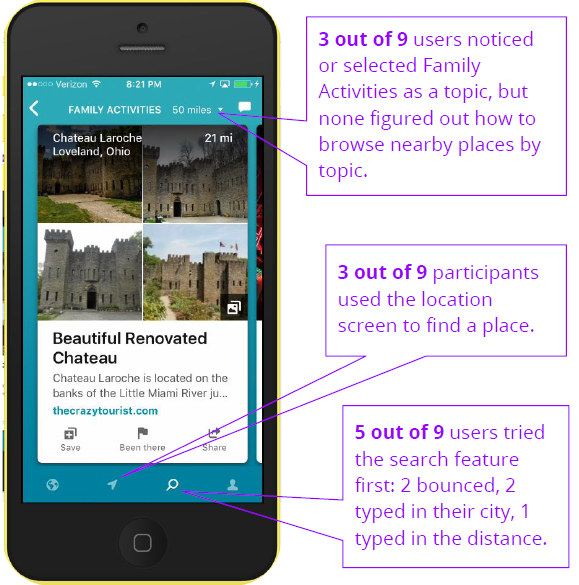
Task 1
It’s a three-day weekend and you want to take a mini vacation with your family. Use the app to find somewhere within 50 miles of you that you would like to go.
Results
Three out of 9 users experienced difficulty finding places, and 4 users remarked that they wanted to see more practical information in the place cards.
Task 2
Find someplace in your city that you’ve visited before and leave a review.
Results
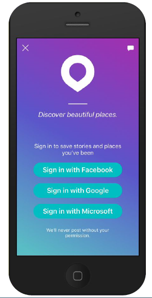
Of the 4 users who did not complete the task, 3 demonstrated they knew how to do it, but were either unable or unwilling to sign into the app.
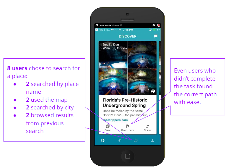
Task 3
You are saving up for a vacation to New York, New York. Using the app, find three places that you would like to go to and mark them in a way that would allow you to find them again.
Results
Three users succeeded with difficulty, either due to sign in obstacles or confusion about the app’s navigation icons. Five users remarked positively about content such as photos, reviews, maps, and seeing more unique NY attractions.
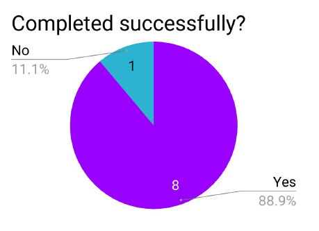
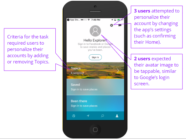
Task 4
You’ve been using the app for a while and want to get better results that align with your interests. Find a way to personalize your account.
Results
Six users either had difficulty finding topics of interest, or were confused about the purpose and organization of topic tiles. Some users’ difficulty may be due to task wording “personalize” not mapping very well to the task. In terms of interaction, Android users expected to be able to use the back button on their phone when they weren’t sure how to go to a previous screen within the app.
Insights and Recommendations
As a result of the test sessions, I derived several key insights about user behavior and expectations, which informed recommended next steps for improving Outings’ user experience. Among them:
Users expect Outings to be able to help them plan a trip.
I recommended conducting formative usability tests to evaluate design concepts and to establish a comprehensive content strategy.
Users expect the Search feature to work just like Google.
I recommended redesigning the Search feature to allow filtering by topic and location within the same search as well as allowing users to choose whether to search or browse a taxonomy of topics.
Users expect content on place cards to be interactive and practical.
I recommended chunking content in a more reader-friendly way so that it’s not cut off mid-sentence, building more internal content that adds value for the user, and allowing users to interact directly with the content.
Requiring Sign in is an obstacle to users.
I recommended respecting user privacy by giving them the option to create a non-linked account for the app and to demonstrate the value of Outings before prompting users to sign in.
Lessons Learned
Test your recording software and equipment thoroughly to avoid 11th hour technical difficulties.
There’s nothing worse than going through the trouble of finding and recruiting the perfect study participant, only to end up wasting their time because you weren’t prepared.
Putting yourself in the shoes of your users not only sparks empathy, but can also help you define tasks for your study.
My brainstorm sessions were more productive when I went through the process of downloading and exploring the app on my own mobile device, and then recording my observations.
Three brains are better than 1.
Group feedback and idea sharing was critical to the success of the Outings Usability project. By working as a team, we were able to more effectively word our tasks, catch each others’ mistakes and oversights, and improve the overall flow of our test script.
For more details about the Outings study, take a peek at the full report.
