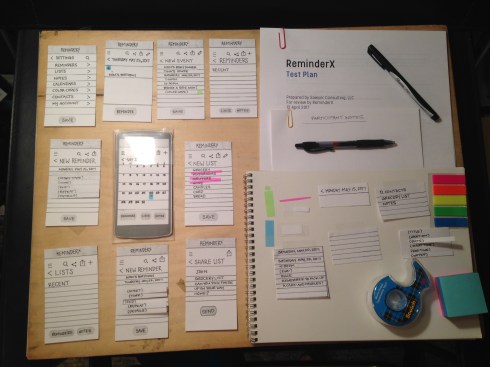
 Preparing a design assessment seemed pretty straightforward at the outset: Purchase some post-its, sticky tabs, X-acto #11 refills, a new 18″ metal ruler (because I can’t find my old one for the life of me), plus a few other odds and ends, then craft the necessary screens, following the design set forth in the original wireframes. Not too hard, right?
As it turns out, this was actually one of the most time-consuming parts of this project for me. I spent several hours on Friday and Saturday planning screen layout, then measuring, cutting, and carefully printing (first in fine 4H pencil, then in black Sharpie pen) all the necessary labels, lines, and icons. I completely overhauled my original wireframes because there was so much I hadn’t taken into account until I actually went to plan a test around them. For example, if you’re on the home screen with the calendar view and you want to add a new event or reminder, you would tap the + symbol, then navigate to a new reminder screen. But, what if you wanted to add a new event instead? How do you know what you’re adding? Clearly there’s a screen (or modal window) missing in this task flow.
As I continued to work with my test materials, I found several potential issues with my design, not the least of which was the icons. I needed a simple way to indicate to users where they could add new things, upload files and photos, edit, share, go back, and search. Some of these were obvious. Everyone knows that a magnifying glass means “search,” but not everyone knows what that little sideways triangle means, or what the square with the up arrow inside means. So, there’s also a problem with the lack of a ubiquitous icon language (and that’s just in the States).
The last and most disappointing problem I encountered was a lack of time and energy to devote to the coupon feature of the app. The whole premise of this feature was to help convert pen-and-paper grocery list people into ReminderX app users by including a really cool, really valuable savings feature. If I could load all my coupons onto my Kroger Plus card just by creating a grocery list and performing a quick search, I would totally use an app for my shoppings lists! Alas, after planning and preparing materials for the navigation, reminding, list-making, and sharing features, there was no room for the coupon feature. I also considered one of my group member’s cautionary words about this idea, even though he had posted his critique too late for me to do anything about it at the time.
Clearly, I need a lot more experience and practice in the area of design assessments, but man, has it been a great learning experience! I guess you could say I am failing and failing often — both for my own good and for the benefit of my (fictitious) users.
