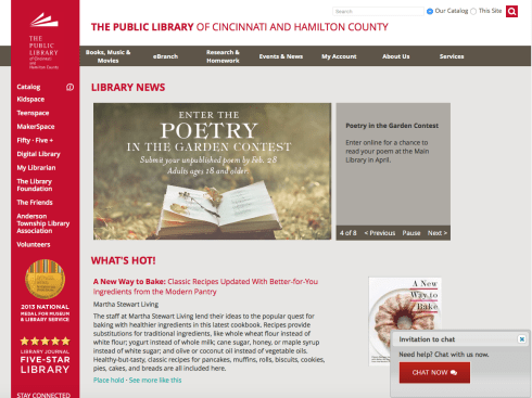
Since we’ve been discussing how the visual elements of organization, layout, and composition apply to usable web design, I thought I’d take a look at my own library’s website to see how it stacked up.
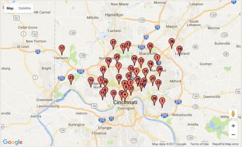
In my responses to posts discussing effective design examples in libraries, I expressed my admiration for the Bellevue Public Library’s website, and I definitely think my library could learn a thing or two about simplicity of layout, distinctive iconography and themed graphics, and use of the grid. However, there is one big reason my library’s website doesn’t look like Bellevue’s: they are a small-town library with a single location serving a population of about 8,000, while the Cincinnati Library is a complex, sprawling system with 41 locations (not counting our Outreach Library) spread throughout Hamilton County that serves roughly 800,000 people.
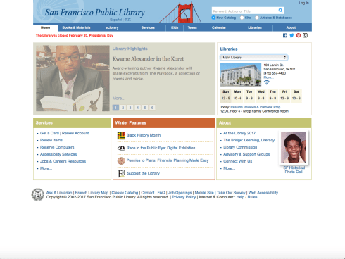
Overall, I think the Cincinnati Library’s landing page is effective through its use of contrast, line and plane, and clear, readable typeface. Visual hierarchy is achieved with the top and right of the page conveying identifying information first (library name and distinctive logo). However, I would like to see our logo scaled larger since this is the main identifying symbol on all of our library cards, signage, business cards, letterhead, and merchandise. Also, the fact that people look for “the big red sign” when they’re visiting one of our physical locations merits more prominent scale and/or placement of the logo on our landing page. After examining the layout of Westlake Porter Public Library’s website, I think the Cincinnati Library’s mission statement—”Connecting people with the world of ideas and information“—could be placed somewhere on our landing page instead of buried beneath the “About Us” menu.
Furthermore, there is definitely room for improvement in the layout and placement of the catalog feature, which is arguably the primary purpose people have for accessing our website. For starters, why do we need two separate access points for the catalog? This just clutters up an already information-dense page. I think a more effective design could involve placing the catalog search right below the banner element, left aligned, set off by high-contrast, clear framing, and scaled large enough so that first time users see it right away. This layout could combine the current entry points into one entry point so that casual users could perform a simple search right from the landing page, and serious researchers could simply click on the “Catalog” label to navigate directly to the more advanced features.
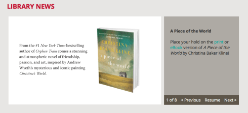
The “Library News” marquee slideshow is fairly effective in providing visitors with quick information about what’s happening at the library, but I wish the captions for each slide were incorporated into the slides themselves, instead of placed separately in a big, flat, gray slab. Not only does it detract from the overall visual appeal of our landing page, it is also static, rigid, and wastes valuable space, as most of the rotating captions do not actually fill the plane, and the dark color doesn’t contrast well with blue links. A better design would place the slideshow controls below the slides, and links to featured events and materials would be imbedded in the slides themselves.
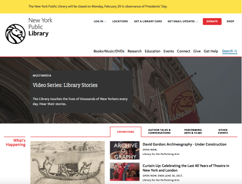
I won’t wade too deep in the weeds this week by discussing the much needed improvements to the usability of our Catalog, which could comprise several more journal entries. Within the limited scope of landing page design, the Cincinnati Public Library succeeds on more levels than many other libraries of similar size in terms of locations, services, and community, as seen in the examples below. On a more humble note, I am reminded that individual viewpoints about what constitutes appealing design are colored by our personal biases.
With that in mind, my opinion should probably be taken with a grain of salt:
I ♥ my Library.
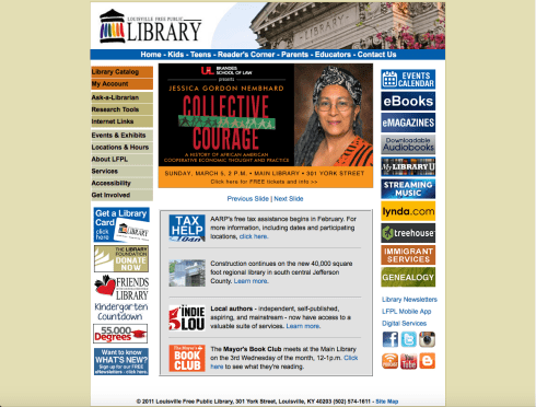
Louisville Free Public Library